Brand Guidelines
for a Filipino
Engineering Firm
R.A. Mojica and Partners is a company that values professional and quality engineering services to its clients in the Philippines. What started out as a request for a website redesign, transformed into a project to create brand guidelines.
Project Scope
To expand on the client’s request for a new website design.
Tools
Adobe Illustrator, Adobe InDesign.
Skills
Logo Design, Branding, Typography, Photo Curation, Layout Design
Client
R.A. Mojica and Partners
Project Length
1.5 months
Process and Breakdown
Initial Problem Request
The client had asked for a redesign of their website.
Discovery
Research unveiled that aside from a logo they didn’t have set colors, branding, and art collateral.
Revised Problem Statement
The client needs branding guidelines to showcase that their brand identity is as good as their work ethic. We will know this to be true once all collateral like business card, letterhead, and website follow the brand guidelines.

Final Solution
The final product was an 8.5”x11,” letter sized brand guidelines. It is easy to print and small enough to share via email.
Design Development
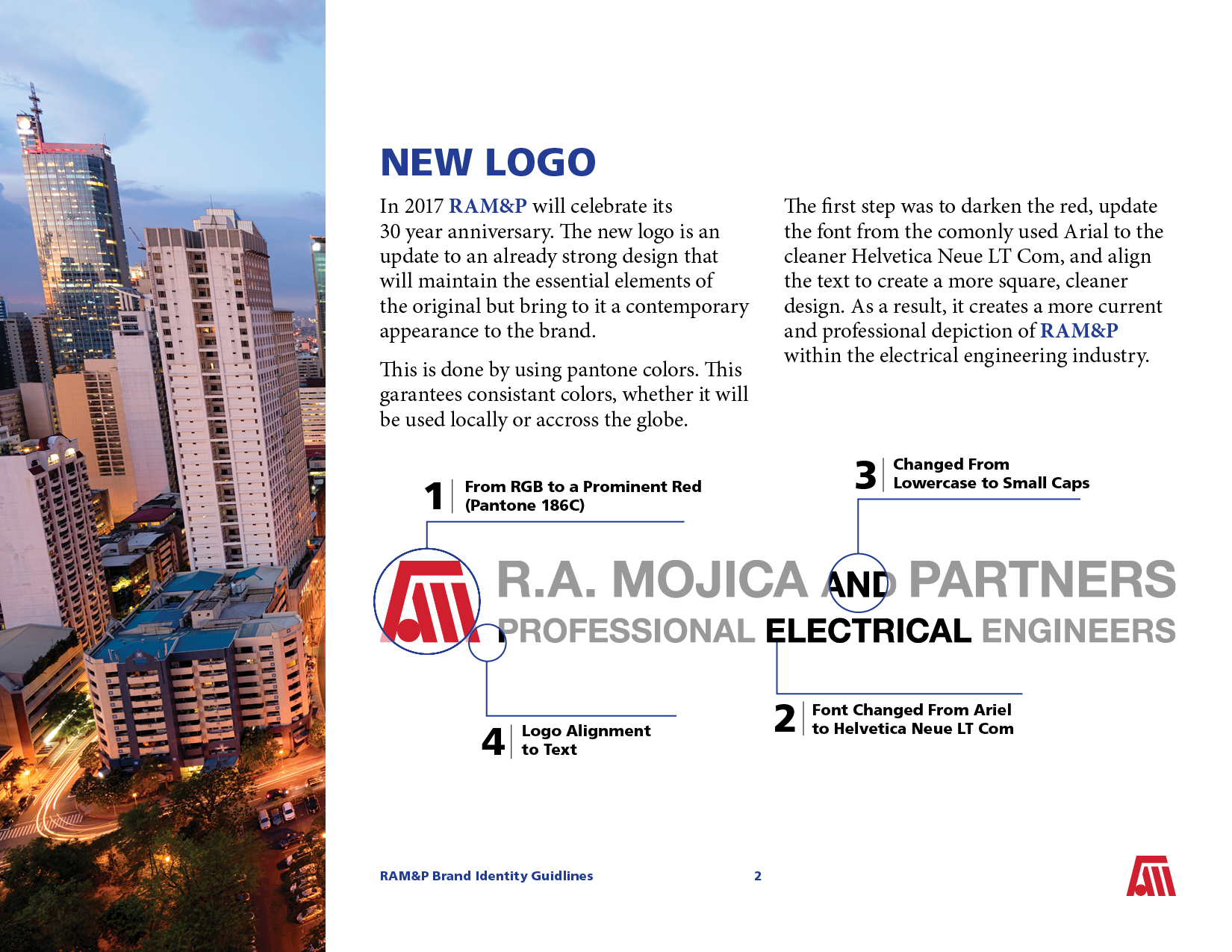
Logo Update
The logo mark was already strong and didn’t need to be changed, but the logo as a whole needed to be brought into the modern age.
This included converting the .jpg of the logo and converting it into a vector file, updating the font, and strengthening the red of the logo mark.
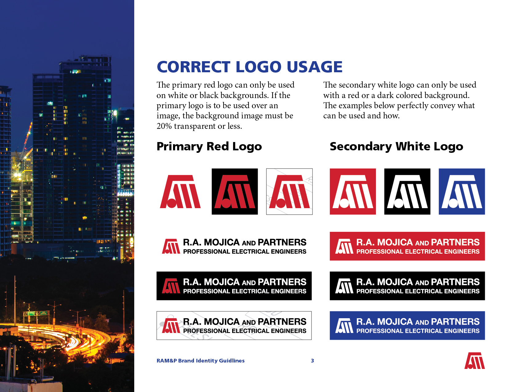
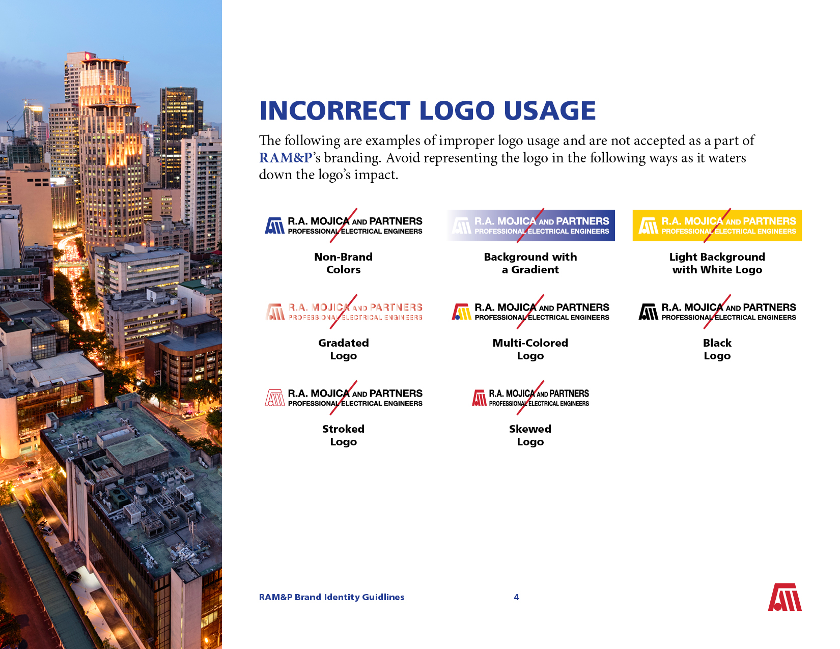
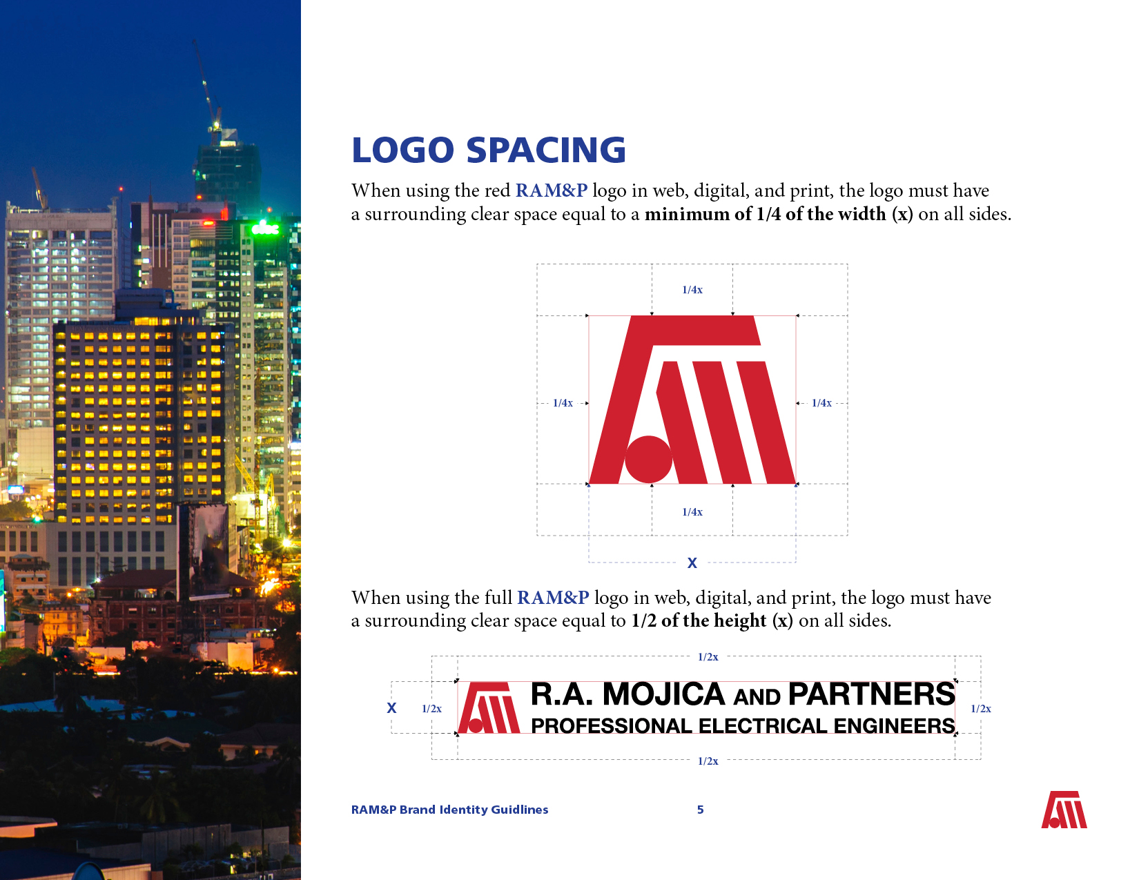
Logo Usage Rules
Sometimes there is confusion on how to use the logo. Setting a specific rule set on what is correct and what is incorrect use helps to set a standard for quality control.

Colors
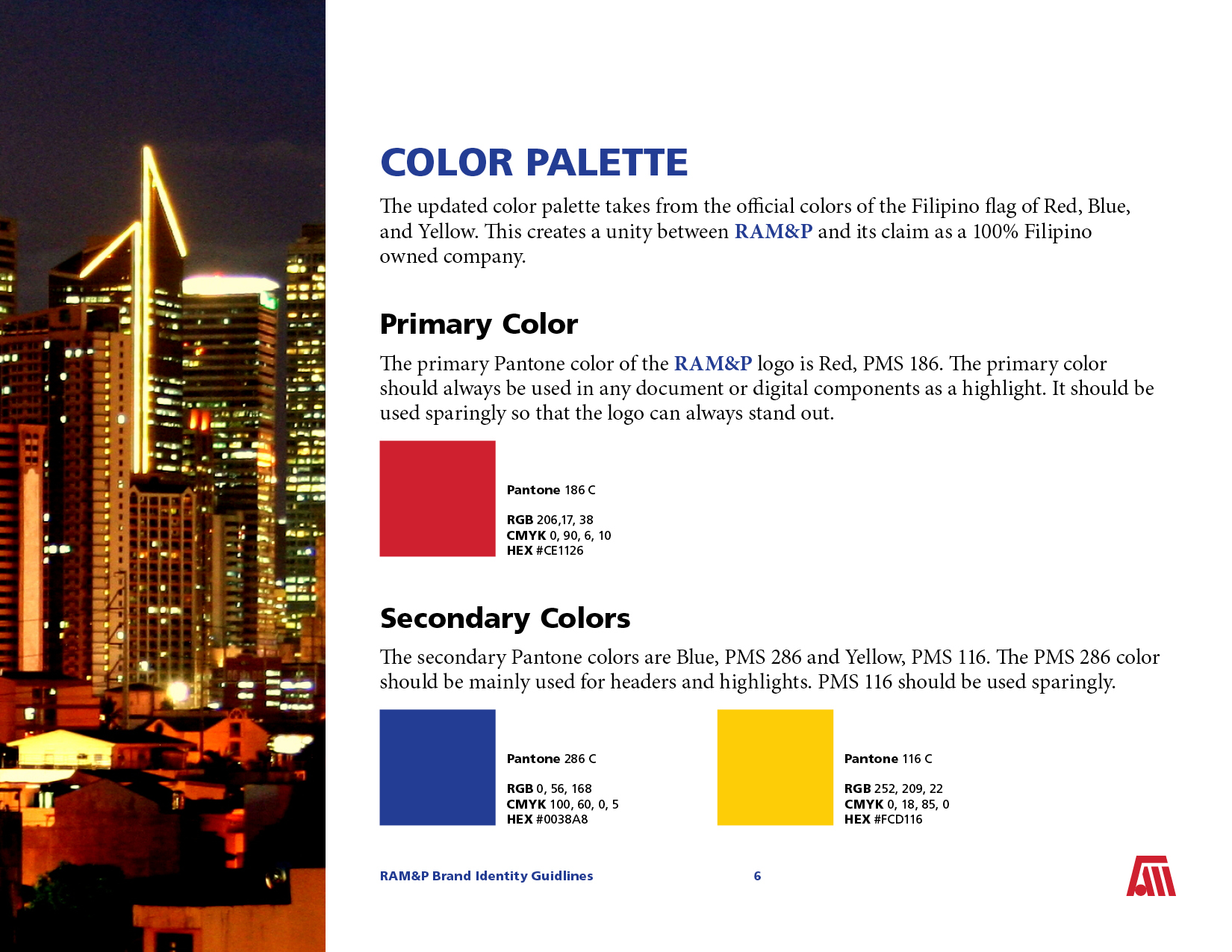
Another important aspect is to keep the branding consistent across platforms by narrowing down color use. The blue Pantone color being top and center for color use makes sure that the logo’s red isn’t being over used. The yellow is an additional color that helps for highlighting important information.
These colors being selected wasn’t by accident. They represent the colors of the Philippines flag as being a Filipino owned engineering firm is in of itself a sense of national pride.
Typography
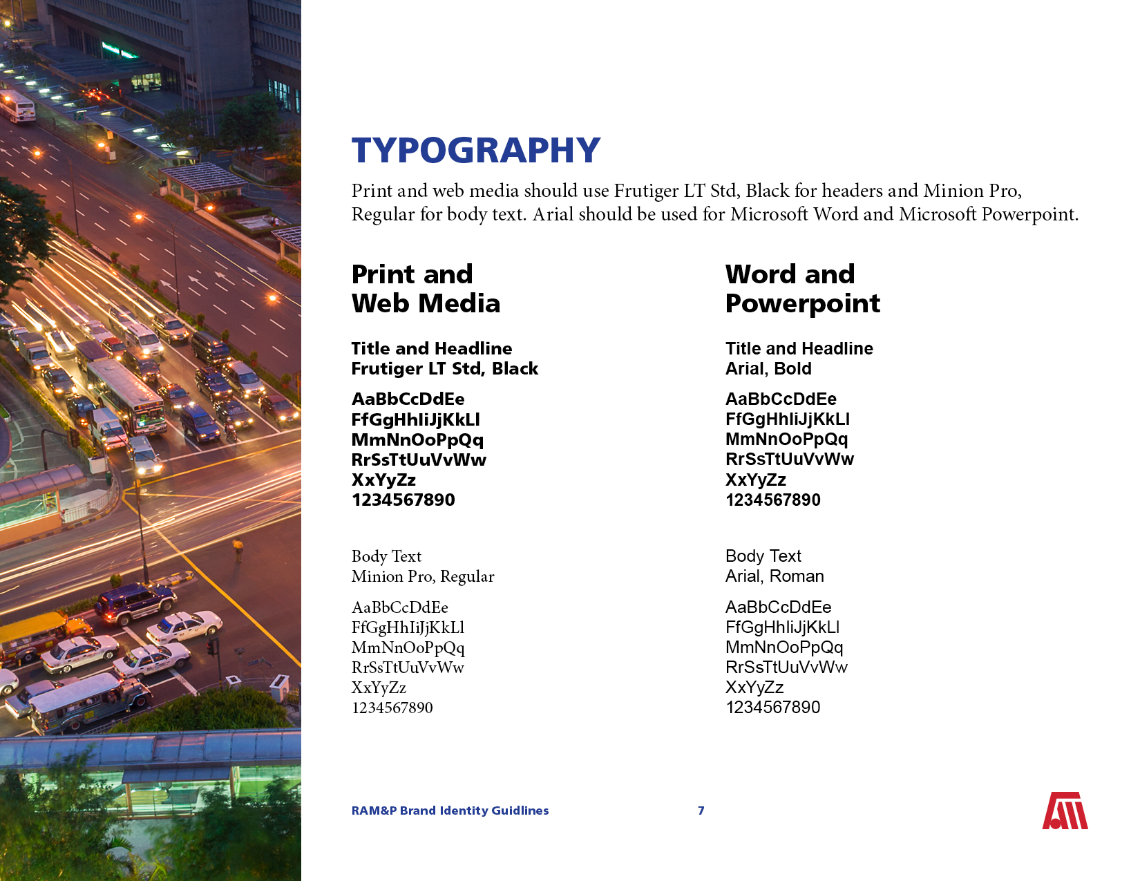
Setting the right font for the specific platforms is important for visual consistency. Certain fonts don’t carry over when sharing Word or Powerpoint files. But printed and web material that can use and save designer fonts are more likely to impress clientele who respect attention to detail.


Photography
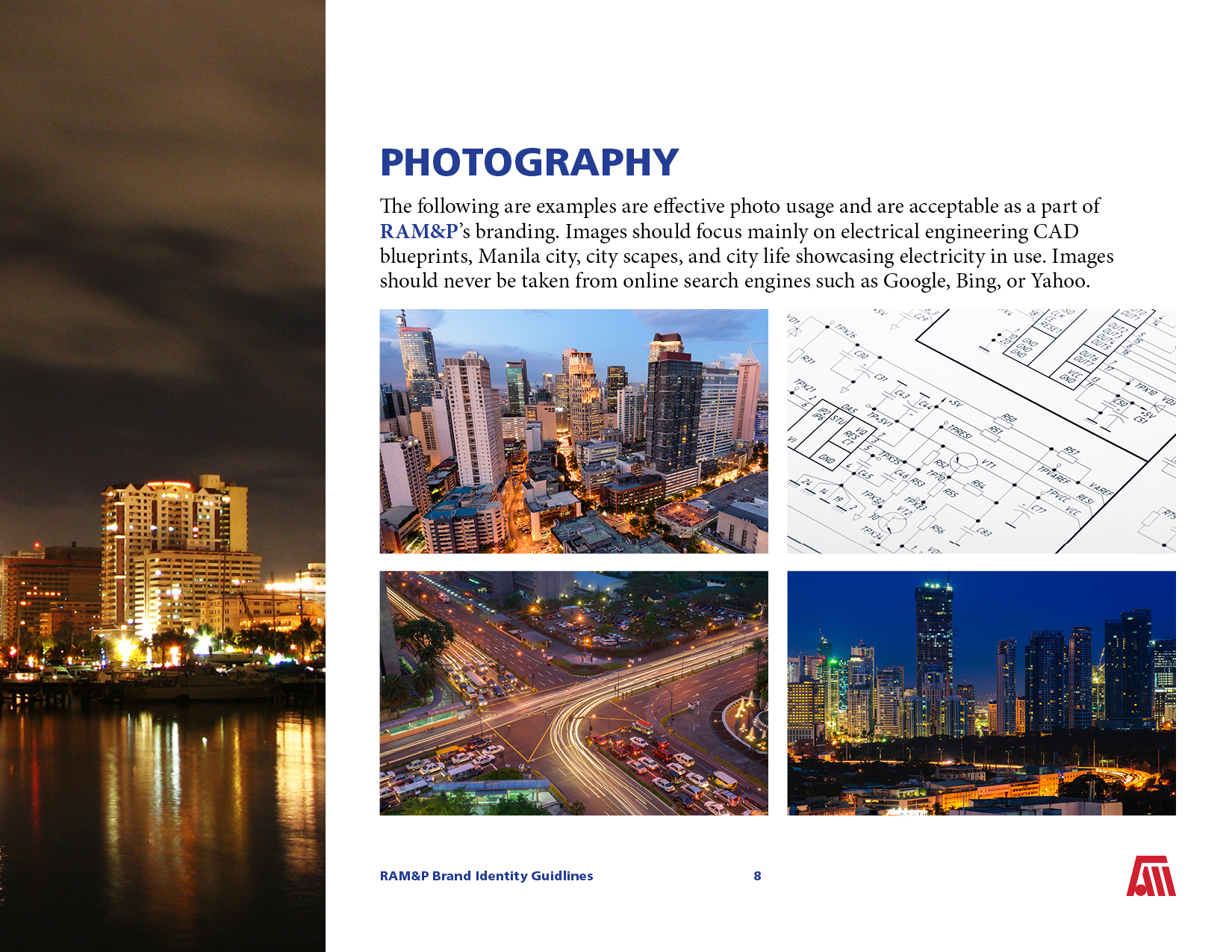
Another aspect that is important to have but may not be commonly used is having a set style for stock photography. This too can help with a consistent brand identity. Places it may be used could be end of the year reports, promotional media, and even advertisement.
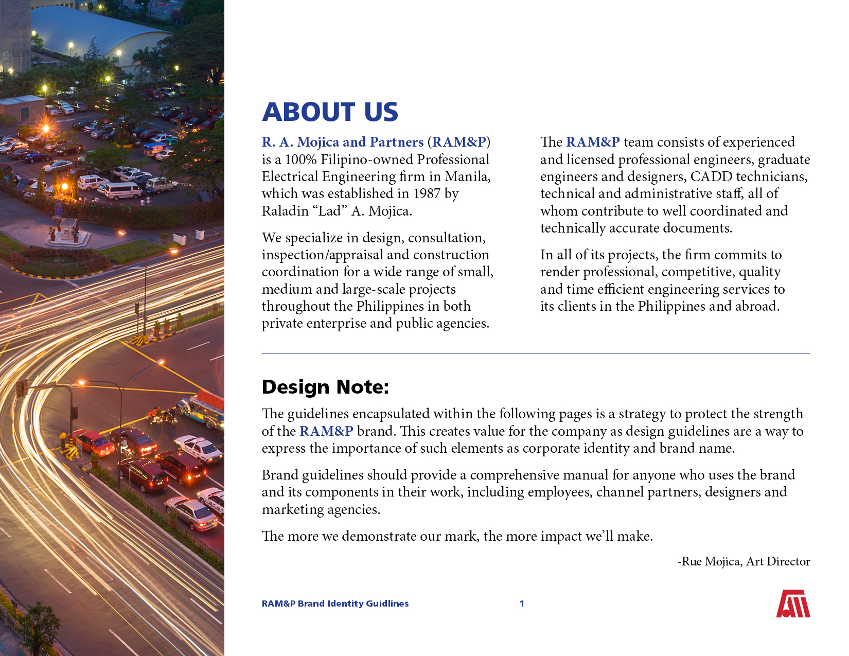
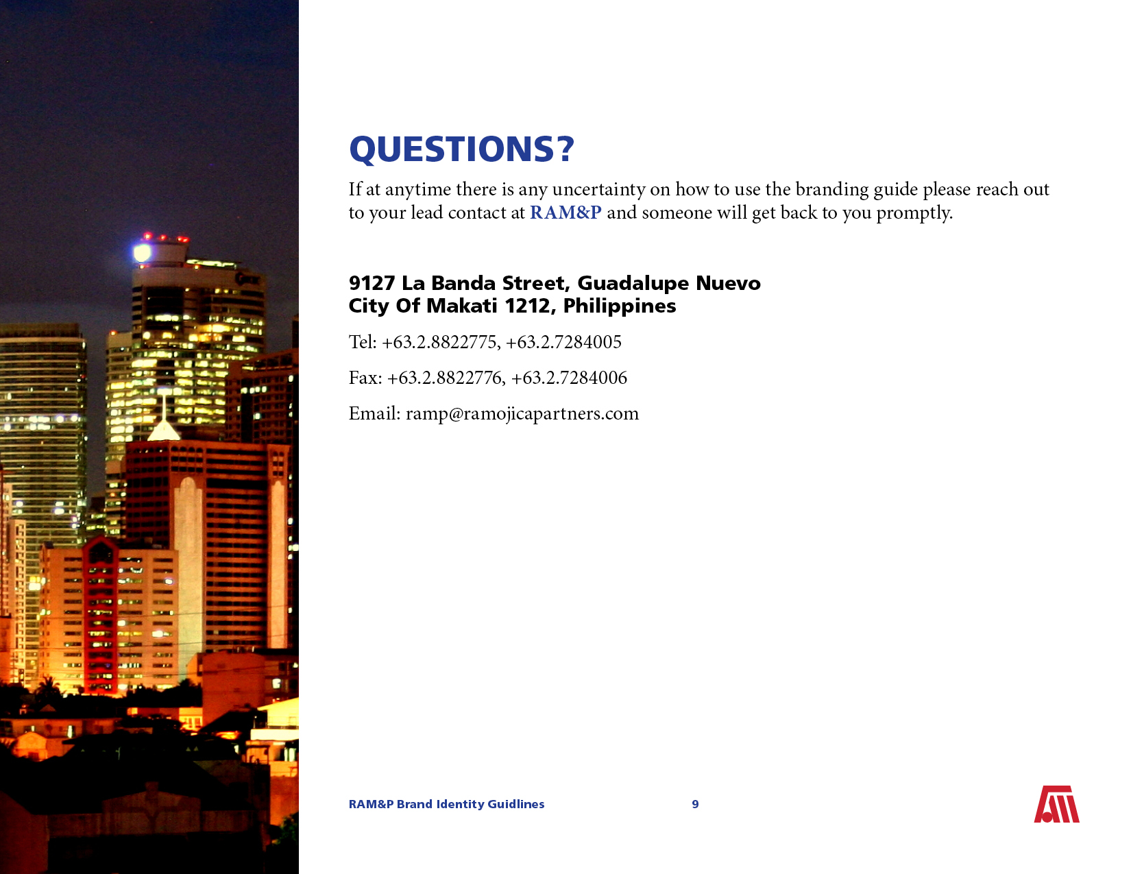
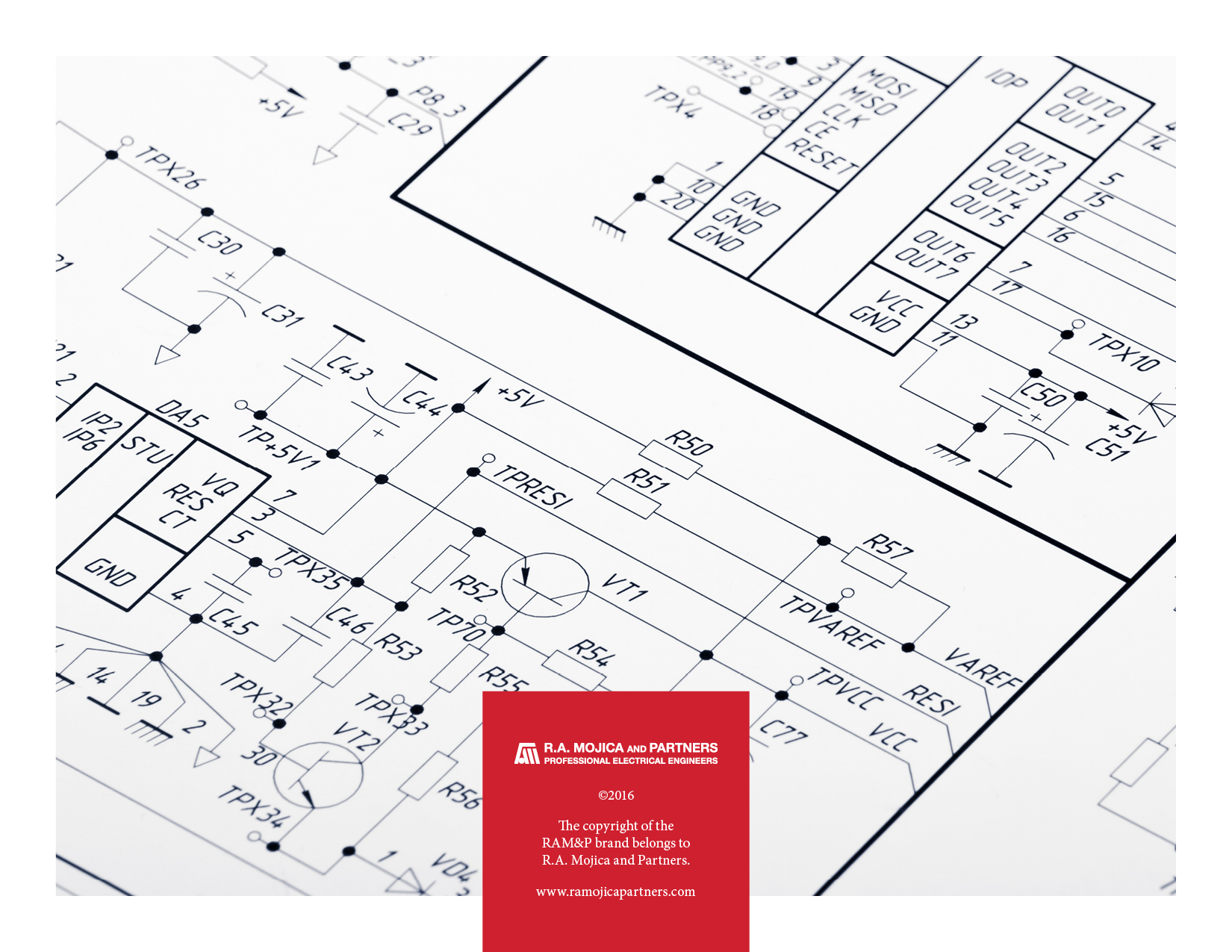
The company is based in Makati, Metro Manila of the Philippines. The city already boasts electrical engineering marvels at their finest. This, as well as blueprint drafts, are a great way to showcase the company’s roots as well as class.
Delivery
The final product was an 8.5”x11,” letter sized brand guidelines. It is easy to print and small enough to share via email. I was and still am very happy with what I created and how I presented it.
Unfortunately it is currently not in use and has yet to get approval. If I were to revisit this project, one of the only two things I would like to update would be the font choices and an expanded color base with multiple tones of the red, blue, and yellow. One of the biggest changes from 2016 when I first made this brand guidelines is easy access to quality free fonts from Google and Font Squirrel that are modern and clean.
I look forward to working with R.A. Mojica and Partners on future projects as well as a redesigning their website.
Click on the Brand Guidelines below to be brought back to the top of the page where you can scroll though the finished project in the image slider.
