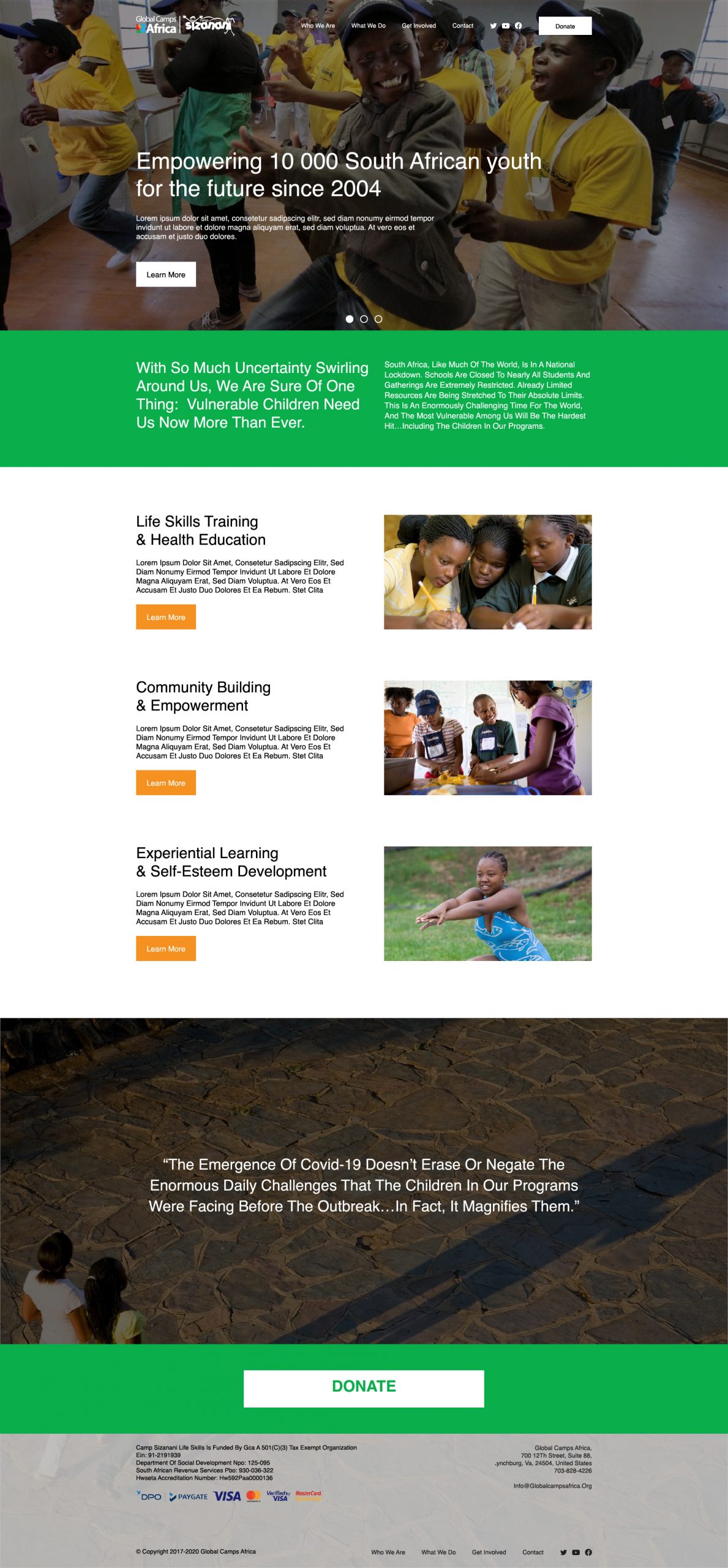
Website Audit & Redesign for an International Nonprofit
Global Camps Africa is a nonprofit that strives to change the lives of South Africa’s vulnerable children through a shared camp experience. My team and I found that their website was not easy to navigate. We analyzed the website and broke down what we thought needed to be changed.
Project Scope
To analyze Global Camps Africa’s (GCA) website for pain points and find ways to restructure how they present their message.
Tools
Google Docs, Adobe XD, Adobe Photoshop, Adobe Illustrator.
Skills
Research, Wireframe, Webdesign, Interface Design.
Group Members
Kara Barnes, Mike Abrams, Ruben Mojica
Client
Global Camps Africa (GCA)
Project Length
2 months
Process and Breakdown
Initial Problem Request
The website exhibits a lack of design standards required of most organizations. Our job was to break down everything that didn’t work with the website.
Discovery
- Pressing “Esc” on any part of the website shows SquareSpace log in. This is a security risk.
- Overwhelming amount of written content on the main pages. Websites shouldn’t be where you put all the information at, this should be a brochure that sells someone into looking for more information.
- Use the 3 second rule. What can you showcase/present that gets someone to stay and read the information.
- Important information should only take two clicks at most to get to.
- Content on all pages are constrained to a narrow column.
- Does not utilize the four creative design principles of Contrast, Alignment, Repetition, and Proximity.
Final Solution
Sticking with the logo’s colors as the website’s base branding, the final website encompasses a complete restructure of the navigation as well as a cleaner layout of content. Global Camps Africa had a multitude of photos that helped tell the story more than any body of text could.
Delivery
Global Camps Africa was not hard to work with at all. If anything, they were very welcoming in any and all criticisms we had of their website. This made it easy to move forward with our restructuring mockup.

