UX Case Study
Reimagining the Wait Times at the DMV
The District of Columbia’s Department of Motor Vehicles (DMV) has been known to not be as efficient as residents would like. My team took it upon ourselves to see if we could create a user experience solution case study.
Project Scope
To find if we can fix the issues that many people have with waiting in line at the Department of Motor Vehicles.
Tools
Google Docs, Google Slides, & Google Forms, Adobe XD, Adobe Photoshop, Adobe Illustrator.
Skills
Research, Wireframe, Storyboard, User Flow, User Interviews, Image Manipulation, Logo Design, Web Design, Interface Design.
Group Members
Kara Barnes, Mike Abrams, Ruben Mojica
Client
The District of Columbia’s Department of Motor Vehicles (DMV)
Project Length
5 months
Process and Breakdown
Initial Problem Request
DMV users have continued to vocalize their displeasure in the lack of efficiency and ease of use in DMV services. Our team set out to research what issues the users of the DMV might be facing.
Discovery
Initially, our team created two surveys on the District of Columbia’s DMV user experience while digging into blogs and online communities for pre-existing complaints.
During this time, we analyzed two other case studies on the DC DMV conducted in 2019.These specific case studies proved useful as we combined all three studies’ surveys narrowing in on overlapping questions to understand the prominent issues users faced.
Revised Problem Statement
- How might we restructure the website to make it easier to search for information?
- How might we decrease waiting times at the DMV or alleviate the feeling of a wait?

Final Solution
The two solutions we moved forward with were to 1) change the layout of the DMV’s website navigation, and 2) to develop a line queue smartphone app and physical beeper device for anyone without access to a smartphone.
Initially, our team created two surveys on the District of Columbia’s DMV user experience while digging into blogs and online communities for pre-existing complaints.
During this time, we analyzed two other case studies on the DC DMV conducted in 2019.These specific case studies proved useful as we combined all three studies’ surveys narrowing in on overlapping questions to understand the prominent issues users faced.
One of the solutions was implemented by the DC DMV by the time we started our research.

Research
Affinity Map
40 users indicated 2 distinguished pain points in their experience.
- 17 thought the physical wait was too long.
- 19 found the website confusing and/or brought the wrong documents.
- 4 had no issues
Solution 1
Website Redesign
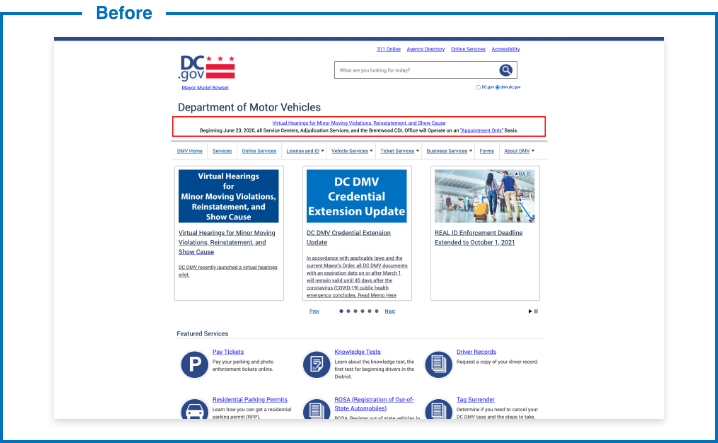
When designing a solution for the DMV website we found it took minimal edits to reorganize the data to be more user centric.
This meant we could move the navigation from middle of the page to the left. It would always be in view even if the user scrolled down.
(This was also when we thought the DMV needed to have their logo slightly modified.)

Pager design and rendering by Mike Abrams.

Solution 2
Pager System
We found three rules applicable to the DMV wait time experience:
- Don’t let users watch, instead, distract, entertain or give mission
- Transparency throughout the process, progress bars or updates
- Set goals you can meet or beat
Therefore, we built an app and proposed a buzzer system to provide autonomy for users while providing transparency throughout the process. This also gives a user permission to leave the physical confines of the DMV to get more important errands out of the way. They then would be able to come back when the app or buzzer lets them know it would be almost their turn.


Storyboard by Mike Abrams. Art directed by Ruben Mojica.
Retrospective & Final Thoughts
In the last 5 years many states have adopted kiosks to address some services not usually available to new users, such as renewing tags and licenses. Studies have claimed that this strategy has decreased wait times, however, cost of installing kiosks and maintenance were not transparent. We can only imagine the cost is much more substantial and resource intensive to implement and maintain over our proposed app and buzzer system.
Future Steps
- Though we updated the logo, the next step would be to create branding guidelines to create design consistency throughout the DMV’s web and app experience.
- Hire a content strategist to remove unnecessary and deprecated pages to refine the DMV’s information as a whole.
- Design designated areas within the DMV where consumers can enjoy their time (ie: coffee shop, eatery, play pen, etc).